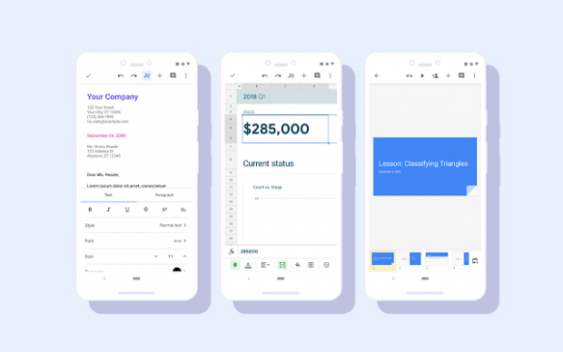
Google Docs gets a Material Design shakeup - and it looks pretty slick

Google has redesigned its G-Suite Android apps, and has made a host of visual improvements.
Google Docs, Slides and Sheets have all been given a bit of a shakeup to make G-Suite easier to use and better-looking on mobile. The highlights include consistent controls, more legible typefaces, a redesigned document list and new iconography.
Related: Best Chromebook
The update is already available for the Google Docs and Slides Android apps - with the new Google Sheets release beginning today. While the rollout has begun, it could take up to 15 days for users to see the changes in their apps.
Google only mentioned the rollout for Android phones but its blog on the release does say the changes will be "Available to all G Suite editions" so expect it to come to iOS sometime soon.
The update is part of Google's long-running Material Design strategy. Google says: "This Material redesign is part of a larger effort to bring consistency to the look and feel of our G Suite apps, with ease-of-use in mind."
From Material Design to tweaks to functionality, Google has been very keen recently to keep its apps at the top of their game.
Related: Best Android phones
Last month, Google Docs finally received a feature that has been a staple of Microsoft Word for a long, long time - real-time word count. Rather than a handy indicator in the bottom corner - like Word - Docs previously required you to click Tools then Word Count to get the info.
Away from G Suite, Google recently rolled out its Material Design philosophy to the Play Store. Gone are the large green blocks and the clunky navigation, Google Play Store now has a much more basic, near all-white design. The new layout replaces the cumbersome left-side navigational menu with options at the bottom of the screen.


