GRIS review

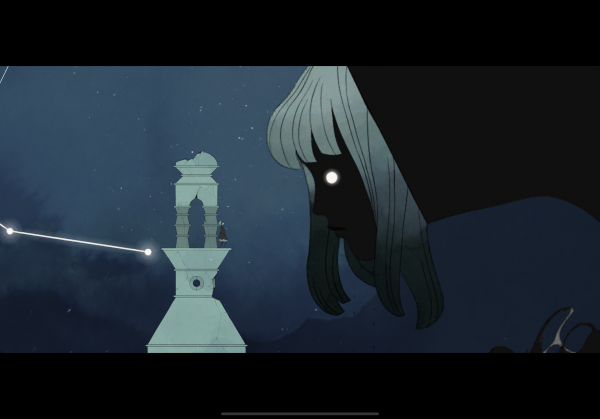
GRIS is a jaw-droppingly gorgeous puzzle platformer from Nomada Studio. In coming to mobile, it had a little bit of a rough landing, but is otherwise surprisingly easy to play on touchscreens (as long as you aren't using Bluetooth devices). All that said, GRIS's beauty feels separated from any kind of context that might make it a more meaningful experience. As a result, the game's emotional core rings hollow, and what remains is serviceable, though not particularly memorable.

Puzzle-first platformer
GRIS may look like a traditional platformer, but it's anything but. You play as a woman who is clearly sad about something as she journeys across several mysterious lands. On your journey, you don't really encounter foes or environmental hazards that might hurt your character. Instead, you mostly just solve traversal puzzles to gather collectibles that let you move on to the next area.
This is strange only in the sense that there's never a feeling of danger in GRIS. You can't fall to your doom, get eaten by an enemy, or run out of lives. It's just you and the puzzles in a desolate world. While this is a neat idea, it also prevents you from feeling any sort of tension as you play the game. This by itself is not a big problem, but it plays a part in preventing GRIS from feeling impactful.
Stone cold stunner
The silver lining of having no in-game tension in GRIS is the fact that it lets you take in the game's incredible visuals. Almost every moment in this game makes for an incredible screenshot, and seeing it all in motion is even better.
Aesthetically, GRIS goes for a somewhat minimal presentation which is juxtaposed with detailed backgrounds and intricate animations for the main character and anything else that moves throughout the experience. The effect is stunning, thanks in no small part to the fact the game runs at a smooth and solid 60 frames per second.
The benefit of this style is it lets you enjoy all of its art and animation with any sort of UI hindrances. The downside though is that certain parts of GRIS are underexplained, overly obscure, or both. At various points throughout my time with the game, little environmental elements were supposed to communicate certain ideas to me, but they were too small or otherwise not clear enough what their function was. As a result, I lost a lot of momentum while playing levels in GRIS, simply because the game-as beautiful as it is-is not good at visual communication.
Minimal meaning
When GRIS doesn't feel like it's being overly opaque, most of the game's puzzles feel really straightforward. This is to say I didn't really feel engaged in the puzzle-solving in the game until about the halfway through it. With a few exceptions, the early levels are just kind of boring. The whole game is by no means a slog, though. Chapter 4 and 5 of GRIS actually contain quite a few high points that push the game's simple mechanics to interesting places.
In a lot of ways, GRIS feels purposely designed to try and tell a beautiful story. This explains the simple mechanics, the focus on art direction, and the lack of tension or danger in the game. The only problem with this is that GRIS's story doesn't really go anywhere or say anything specific.
Sure, the game has moments where your character interacts with something in a way that seems significant, but there's not enough being communicated by the game to tell you why any of it matters, why you should care, or how any of it is related to anything else. GRIS certainly doesn't need to spell out it's plot, but the breadcrumbs this game offers up for interpretation are far too small for you to do much with.
The bottom line
Without a strong mechanical or narrative backbone, GRIS struggles to do much except look really, really nice. I'd love to see more games that look as interesting as this one does, but not if it means making the same kinds of sacrifices. The tradeoff just isn't worth it.


