


Google Play Store gets a total redesign on Android - and it's so much nicer
Google has officially rolled out a new design for the Play Store on Android and it's *chef's kiss* absolutely gorgeous.
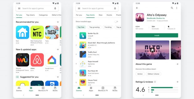
The new app portal, which has been in testing over the last few months, brings Google's now-familiar Material design language into play to bring Android users a much cleaner interface and a more premium-looking experience.
Google says the idea is to "improve app discovery and accessibility for our diverse set of users," with clearer tabbed layouts and new icon designs. In fact, the Play Store now takes more of its design cues from Apple's App Store, with a new navigation bar along the bottom of the screen offering easier access to Apps, Games, Movies & TV and Books categories.
Just like Apple's most recent App Store redesign, Apps and Games are segmented into two, while there is no Music tab within the options at the bottom of the screen. Instead that's available within the main menu.
Related: Best Android phones 2019
In a post on the Android Developers blog, Google writes: "Once users find the right app or game, the updated store listing page layout surfaces richer app information at the top of each page as well as a more prominent call-to-action button. This makes it easier for users to see the important details and make a decision to install your app. You'll also notice our new icon system with a uniform shape, helping content to stand out more over UI."
The new design has been doing the rounds with beta testers as far back as April, while the majority of users began seeing it at the back-end of last week. Why Google has bumped the Music section from the most visual Play Store categories is unclear, but it may be an effort to give Play Music and YouTube Music more of a standalone feel.